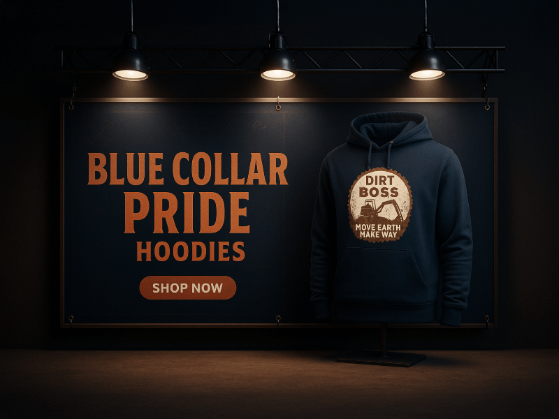
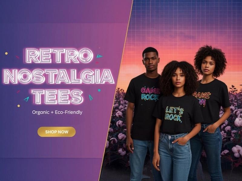
Is your logo standing out in the sea of competition? In today’s visually driven marketplace, a logo's effectiveness hinges on its ability to grab attention and convey the right message. Utilizing contrast in logo design can make the difference between being memorable and being overlooked. This article explores how to use contrast for logo impact, ensuring your design not only captivates but also communicates your brand's essence.
Custom Logo Design Services
Branding Insights
- Understanding contrast is essential for creating visually compelling logos.
- Color contrast can influence perceptions and emotional responses to a brand.
- Different types of contrast, like color and shape, enhance logo recognition.
- Effective logo design combines shapes and text to maximize visual impact.
- Avoid common pitfalls, such as overusing colors or neglecting legibility in logo design.
Understanding Contrast in Design
## Understanding Contrast in Design
Is your brand impactful at first glance? As a business owner, entrepreneur, or creative, capturing attention is crucial, and utilizing contrast in your logo design is one of the most effective ways to achieve this. How to use contrast for logo impact is not just about aesthetics; it’s about creating a strong visual hierarchy that guides your audience through your brand’s message.
### Why Contrast Matters in Logo Design
1. Enhances Visibility: A logo that employs effective contrast will stand out in both digital and print formats, ensuring your brand is immediately recognizable.
2. Builds Credibility: Professional logo design creates an immediate sense of trust. When potential customers see a well-contrasted logo, they’re more likely to view your brand as credible and established.
3. Communicates Brand Identity: Contrast plays a significant role in conveying emotions and messages. The right combination of colors can evoke trust, excitement, or professionalism, aligning your visual identity with your brand values.
4. Originality: A contrast-rich logo ensures that your brand doesn’t get lost in the crowd. It reflects uniqueness, setting your business apart from competitors.
5. Versatility: A well-designed logo using contrast will work effectively across various marketing materials and platforms, from business cards to web pages.
### Emotional Connection through Design
Good design clarifies vision and can evoke strong feelings. Imagine your logo standing out effectively, making potential clients not just remember you, but actually feel connected to your brand.
Design allows you to communicate your story without saying a word. A custom logo not only illustrates your brand's essence but does so in a way that resonates emotionally with your audience. Investing in custom logo design fosters recognition and builds a community around your brand.
To explore how to create a logo that captivates your audience and aligns with your vision, visit [Design Delight Studio](https://designdelightstudio.myshopify.com/pages/stand-out-with-a-custom-logo-that-captures-your-vision). You’ll discover design solutions that resonate with your core identity and create lasting impressions.
### Key Takeaways
• Contrast is a powerful tool for enhancing logo visibility and building trust.
• A professionally designed logo communicates your brand’s identity and values.
• Investing in custom logos fosters originality and versatility across applications.
• Good design creates emotional connections, clarifying your business vision for customers.
### FAQ
What is the logo design process?
The logo design process typically involves research, brainstorming, sketching concepts, refining designs, and finalizing a logo that reflects your brand identity.
How much does a logo design cost?
Pricing varies depending on complexity, designer experience, and market rates. At Design Delight Studio, we provide tailored packages to fit various budgets.
What is the turnaround time for logo design?
Turnaround time can vary, but most projects take anywhere from one to four weeks, depending on requirements and feedback cycles.
To start your journey towards an impactful logo, check out [Design Delight Studio](https://shopify.designdelightstudio.com) today!
The Psychology of Color Contrast
## The Psychology of Color Contrast
Is your logo standing out in a sea of competitors? How to use contrast for logo impact can be a game-changer for your brand’s perception. The right color contrast not only enhances visibility but also evokes emotions and communicates your brand’s personality.
By strategically combining colors, you can draw attention, create a memorable impression, and even influence customer behavior. Here’s why understanding color contrast is essential for effective logo design:
• Grab Attention: High contrast makes your logo easily recognizable and memorable, ensuring that it stands out wherever it's displayed.
• Evoke Emotion: Different colors evoke different feelings. By using contrasting shades, you can create an emotional response that aligns with your brand values.
• Enhance Clarity: A well-contrasted logo allows for clear visibility, ensuring that your audience understands your brand message at first glance.
• Communicate Professionalism: A thoughtfully designed logo with effective color contrast conveys credibility and trust, essential elements in attracting customers.
Investing in a custom logo design that skillfully employs color contrast is not just a matter of aesthetics; it's pivotal for your brand's success. A professionally designed logo can clarify your vision and help your brand resonate with your target audience.
Your logo is the face of your business—make sure it shines brightly against the backdrop of your industry! Explore more about creating impactful designs at [Design Delight Studio](https://designdelightstudio.myshopify.com/pages/stand-out-with-a-custom-logo-that-captures-your-vision) and unlock the visual potential of your brand today!
'Design is not just what it looks like and feels like. Design is how it works.' - Steve JobsCustom Logo Design Services

Types of Contrast in Logos
When it comes to designing an effective logo, understanding how to use contrast for logo impact is crucial. Contrast can enhance visual appeal, ensure legibility, and communicate your brand’s personality effectively. Here are the primary types of contrast you should consider:
###
1. Color Contrast
Choosing colors that stand out against each other can make your logo eye-catching. For example, dark colors against light backgrounds create visual interest and ensure that your logo is easily identifiable at a glance.
###
2. Shape Contrast
Utilizing a mix of geometric and organic shapes can help your logo stand out. Sharp edges can symbolize precision, while rounded shapes might evoke friendliness or approachability. Combining both captures attention and adds depth to your design.
###
3. Size Contrast
Playing with the sizes of elements within your logo can convey hierarchy and importance. A larger element (like a symbol or your company name) can draw the eye, while smaller elements can add intricate details that enhance the overall composition.
###
4. Texture Contrast
Incorporating different textures or finishes can bring a tactile quality to your logo. A matte background with shiny text can create an intriguing effect that attracts viewers even more.
###
5. Font Contrast
Combining different fonts can provide a dynamic quality to your logo. Pairing a bold font with a lighter, more elegant type can create a sophisticated look that balances strength and elegance.
By effectively utilizing these types of contrast, you can enhance your logo’s impact and ensure that it resonates with your target audience. A logo that embraces contrast isn’t just memorable; it tells a story about your brand. Don't underestimate the power of good design!
Combining Shapes and Text for Maximum Impact
When it comes to designing a standout logo, using contrast for logo impact is crucial. Combining shapes and text effectively can create a visually compelling brand identity that captures attention. Here’s how to leverage contrast in your logo designs:
• Choose Contrasting Colors: Utilize a color palette where light and dark colors play off each other. For instance, a vibrant color against a muted background can accentuate your brand message.
• Mix Shapes and Typography: Experiment with geometric shapes paired with bold fonts. A sharp, angular shape alongside soft, rounded typography can create an intriguing juxtaposition that draws the viewer's eye.
• Balance Simplicity with Complexity: Opt for elements that are not overly complicated. A strong logo balances simple shapes with thoughtful text placement, ensuring that each component stands out without overwhelming the viewer.
Implementing these tips will not only enhance the visual appeal of your logo but also embody the essence of your brand, ensuring it resonates with your audience on a deeper level.

Common Mistakes to Avoid
When creating a logo, one common mistake is neglecting the essential principle of contrast. How to Use Contrast for Logo Impact is critical to ensuring your brand stands out in a crowded market. Here are some common pitfalls to avoid:
• Insufficient Contrast: Using colors that are too similar can make your logo hard to read or recognize. Aim for combinations that are visually striking.
• Ignoring Emotional Response: Colors invoke emotions; ensure your choices reflect your brand’s message. For example, blue often conveys trust, while red signifies energy.
• Overcomplicating Design: Too many contrasting elements can confuse rather than clarify. Keep it simple for stronger recognition.
• Neglecting Versatility: Your logo should be effective in various contexts and sizes, so test how contrast plays out on different backgrounds.
By mastering the use of contrast, you can elevate your logo from merely functional to a captivating emblem that resonates with your audience.
Examples of Effective Logo Contrast
## Examples of Effective Logo Contrast
When it comes to designing a logo that truly stands out, understanding how to use contrast for logo impact is crucial. Contrast not only enhances visibility but also strengthens your brand's message. Here are some examples of effective logo contrast to inspire your design journey:
• Color Contrast: Think of the vibrant red and white of Coca-Cola. The high contrast makes it recognizable from a distance, emphasizing energy and excitement.
• Shape and Form: The simple yet bold combination of round and angular shapes in the Adidas logo creates a dynamic look that is both modern and inviting.
• Textures and Patterns: The combination of smooth letters paired with a rugged texture in the Harley-Davidson logo conveys grit and authenticity, capturing the spirit of adventure.
By studying these examples, you can start to understand how effective contrast not only captures attention but also communicates your brand’s values and mission clearly. Contrast is an essential tool that, when used effectively, can elevate your logo from simple graphics to a powerful visual statement that resonates with your audience.
Custom Logo Design FAQs
What is contrast in logo design?
Contrast in logo design refers to the differences between elements, such as colors, shapes, and sizes, which help create visual interest and guide the viewer's attention.
How does color contrast affect logo perception?
Color contrast can significantly influence how a logo is perceived, as certain color combinations can evoke specific emotions and associations, making the logo more memorable.
What are the different types of contrast that can be used in logos?
Different types of contrast in logos include color contrast, shape contrast, size contrast, and text versus background contrast, each serving to enhance the visual impact of the logo.
What are common mistakes to avoid when using contrast in logo design?
Common mistakes include using too many contrasting colors that clash, not ensuring sufficient visibility of text against backgrounds, and neglecting the balance between contrasting elements.
Can you give examples of effective logo contrast?
Yes, brands like Coca-Cola and Nike effectively use contrast in their logos by combining bold colors with simple shapes, creating logos that are instantly recognizable and impactful.
This article is brought to you by Design Delight Studio.
We craft strategic, visually impactful custom logos that help brands connect with their audience and grow with confidence.
Contact us at mailto:designdelightstudio24@gmail.com.


0 comments